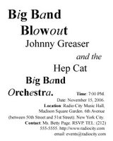
Here are my composition exercise
The first one was created with Tahoma. I intended to create a balance so I divided the name of the Ochestra into two parts and put them into two opposite angles of the paper. The word "and" is in the center and other words were arranged around it.

The second one was created with Times New Roman. I just arranged words in order to form shapes of opposite triangle.


3 Comments:
You were able to clearly organize the information into logical groups which was the main objective for this exercise. In the first composition, I believe it may be too busy. Keep in mind that our eye must scan the entire document at first and make sense of where to begin. If there are too many elements commanding attention, it affects the delivery of the information. I don't have much of a problem with the unconventional use of type styles in the heading, as it can clearly be seen as relating to music and this treatment exists mainly in the title and not the body text. However, the second composition is more readable, though you may consider providing more space between the categories in the text at the bottom. They blend into each other creating one big block when there should clearly be two separately visible groups.
By r. streitmatter-tran, at 9:30 AM
I like the second poster. It is easier to read than the previous one. The text is arranged in rhythm. But I think that you should create 2 different groups: 1 for time, date and location, 1 for email address and contact information. This will make the viewer trace information easier.
By Bui Thi Hang Nga - s3146313, at 8:17 PM
The second one is easier to read and notice. However, if you seperate the last group, it will be more effective.
By EMERALD, at 2:25 AM
Post a Comment
<< Home