Green Glass 2

Welcome to my blog!

I am looking at life through a green glass...
____________________________________________________________________________

Sunday, December 31, 2006

Rendezvous 2 event


We have had chance to attend SOC (Saigon Open City), an important event in contemporary art in Vietnam. Now we also have chance to get used to contemporary and digital art through Rendezvous. It is an event organized by Wonderful District. This event is to promote contemporary art activities in Vietnam and to raise the Vietnamese people's awarness of digital culture. In my opinion, such events are very neccessary for Vietnamese people to make them know more about contemporary art and digital culture. This event is anually held in Ho Chi Minh city.
The first Rendezous event was held in 2005 at three locations in HCMC: the Fine Art Museum of HCMC, the Blue Space Gallery and Galerie Quynh. This year, the event will be held with more activities in 4 days with the participation of many international artists (Mr Rich is one of them). The organization board estimates that more than 2500 people are expected to attend this event. This event includes many kinds of contemporary and digital art such as: video and sound installations, animations, video art compilations and graphic works. It open the opportunity for experimental arts and artists. I think you have known about experimetal art in Vietnam and RMIT through the play "Nhin" by Phan Y Ly or the development of DJ activities in big cities. It is digital culture.
The word "OXYGEN" was chosen to represent Rendezvous this year because it is the name of a electronic instrument (MIDI sound) which is used by electronic musicians. It is considered as the connection of many other art works.
I think we should take some time to learn some things from this event, although I know this time is the busiest time in the semester. I have received the Rendezvous documentation and graphic design competition from Design club. Anyone of you want to find more about this or attend the competition can contact me.
Friday, December 29, 2006

3D art works of Friedrich A. Lohmueller

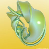
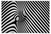
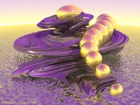
I have found some 3D art works of Friedrich A. Lohmueller. In these art works, he used shapes and colors to create impressive pictures. These shapes look strange and sometimes weird but they make the viewers feel interested and curious. Also, the colors of them are special. You can look them and find that the color are very suitable. Just look and find the special things on them:

Let's see the combination of colors: black and white, pink and yellow, brown and gold. These combinations are great and make all pieces united together.


These shapes, having meaning or not, create a good theme for the whole piece. Also, the colors here are good. The piece I like most is The Candles because of its colors.

As I know, you have to work with 3D software in semester 5 or 6 so I think it is a good source for us to get used to.
Please visit http://www.f-lohmueller.de/pov/im_bo9.htm


Thursday, December 28, 2006

Look around you and find your texture

The important skill for designers: Looking and learning from everyday things.
When you are trying to find an idea for your design or more particularly for your assignment such as Book cover, Flash project, ... where can you find ideas for this? Do you think you can go to bed, take a sleep and an idea will show up? It is impossible, or if it happens, lucky you , but only for this time, what is about the next time?
As the role of a designer, you certainly have a chance to use a texture for your design in your career. The easiest way is that you go to the internet to find some. However, these textures are made by other people and are used by many people in the world. So they don't have a particular style and they are easy to make viewers feel boring because they have seen them many times before. So you should have your own textures source.
So come back to the topic of this post. How can you find a idea, or texture, for your design. The only way is to go out, look around you, hear the sounds from everything and try to find news things from this. You are often blind with everday things and sometime you don't realize their existence. So the key is that you have to really open your eyes and other senses. Once you have done it, you will probably see many news things that you have never seen before. This time, the best way is to take a photograph or take some notes in your handbook.
I have applied this way recently and I choose the camera to record textures which I have found. Below are some of my pictures. This is not I am showing my skills or some things like that, I just want to share some experience:


I think you should think about that and if it is possible you can apply it in your design career. If you have decided to learn about design, please respect it and put strong efforts on it.

Saturday, December 23, 2006

Poster advertising

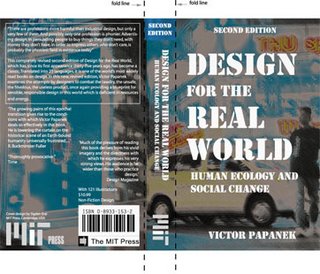
We are learning design so we must deal with problems in advertising in the future. When I created the book cover for the book: Design for the Real World by Victor Papanek I have realized that designing advertisement has positive and negative aspects and it is up to you. I have found some advertising and promotion pieces which look good. They are in the collection of AIGA 2006. In my opinion, a good advertising is the one which does not say much lies about the product, just let the visual elements speak for themselves:
Firstly, the "American Dream" poster for Theatre S3 designed by Michael Bierut:

I think the idea is interpreted very clearly and impressively here. The fork is a little bit skewed but still creates a balance for the poster. The typography is hand made by designer and they are around the fork. All of them make the poster a special and ironic view.

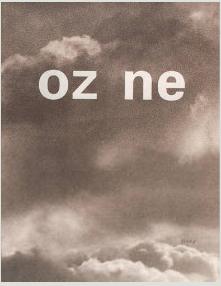
This poster "Ozone" made by Douglas G.Harp (1993) is a good example of the combination between typography and image. I think the missing of the word "O" represents the hole of ozone layer of earth. The background color also signifies the polution atmosphere.

The next is the poster "Now is not the time to compromise" by Craig Frazier in 1994. This poster looks like a impressionism painting. The designer uses very strong and hot colors to convey the meaning of the poster and maybe designer's feelings. Looking at this poster, we can see at once that there is no time to wait.

The last is a poster "Recruitment" of Herman Miller. He has been a internship student of Graphic designer for over10 years. He made this poster and sent it to companies to get experience in the "real world". The special thing in this poster is that it is made from a very low budget. As you see, the image is merely a line art picture. Some people think this is an infinity symbol, others think that it is only a man with a hat. It is up to you.
You can find more pieces at http://designarchives.aiga.org/

Storytelling in Flash assignment

Firstly, I want to wish you a Merry Christmas and a Happy New Year. I wrote this post in the cool atmosphere so it feels quite good and suitable for a Christmas day.
Now I want to talk about Flash and the way to create a story in Flash. As you know, the next and the last assignment of DIM2 is a Flash Project. In this assignment, we need not only the Flash skills but also the techniques of creating a story for our Flash. This story must be funny, interesting, logic, non-linear and interactive.
Here are some hints and tips which I have got and I want to show you as a help:
- The first thing is that you must have a main character. The number of side-kicks or secondary characters is up to you but not so much, the best number is 2. This main character must have a situation which can introduce his biography and the following actions must be fitted to it. For instance, a fierce man will probaly have actions of beating animals or somethings like that.
- We also need a theme like film genre. It is easy but you must be sure that all details in your story will focus on this theme.
- As we have learned in class, there are many stages in a story, but for a short story, we sometimes need only 3 stages:

  • Begginning: all characters are introduced and the conflicts are created.
  • Middle: conflicts go to the peak and character must give his decision.
  • End: conflicts are solved and the end is up to you.

- Do not insert so much details in a short story. You should put only most neccessary ones into your story.

- The lines and words of your characters should be clear or you can write them down like subtitle to help viewers to follow your story.

- About the non-linear structure, I am sure that you have learned so much so I won't repeat. However, you must be careful when creating non-linear story which is actually a multi-linear story. For Example, you start from a point, then there are there lines coming from this point but each line only follows a certain and straightforward story line, it is so boring. I just want to introduce you a common structure which some games and story have adopted:

This is called Braided. Although it is still a multi-linear but it is very useful and not boring. I think we can extend it into our story.

You can read more at http://www.shortstorygroup.com/storytips.htm and the article:
"Story Shapes for Digital Media"
Copyright 1996, 1998 Katherine Phelps

Friday, December 15, 2006

Vietnam photographs

I have a special interest in taking photograph. Photograph is more than a tool for recording life but it is also the tool for releasing our feelings. When feel sad or happy, your photos will reflect that. A picture of sunset will reflect the sad mood while a picture of rainbow may reflect a happy mood. This is a fact that can be realized easily. Actually, suddenly taken photos often bring the best effects. I were travelling around webs and go to one of my favourite sites about photography. Here I have found some images which look good and even remind me of some feelings I have had in the past.

This is the photo of Huynh Phuc Hau. The color of this photo is really attractive. The yellow tone dominates the whole photo and make it vibrant. The line of bicycles converges into a far point so it makes the picture not become boring. The sun is unintentionally put into the rule of third and it also creates balance for the photo. As I have said, arbitrary photos are the best.

In this photo named , author "longpt" has must been travelling and observing for a long time to find the special shape of these palm trees. I have to say that his effort is worth. This shape not only attract the viewer's attention but also make the photo more balance. The author said that he has used filter lens to make the BW picture more contrast.

This is the photo named "A market corner by night" by longpt. This picture has a very special light and theme to me. It reminds me of some feelings which I believe some of you may be also have.The cool light of the street lamp. The shadows under houses and particularly the quiet atmosphere. All of them are special (except a boy sitting on pavement!!) .


This picture named "Before seeding time" made by many lines. A man in the third part of the photo contribute to make the photo lively and not boring. The most impressive factors are surely the green lines which form some problematical shapes.

The last one is a nude photo posted by JoeBlack. The pose of the model is really special. In addtion, the skew position also make the photo more attractive.
http://www.photo.vn/

Wednesday, December 13, 2006

Some things about Virtual Urban

Virtual Urban - this is a topic of the recent presentation of my friend, Phuong - is a interesting concept. As an assistant (not a partner) in the preparation of this presentation, I have done some research and been an model for his pictures. Phuong has done an excellent presentation with many supporting sources and images. With the knowledge which I have gained from these resources, I think there is some things in this the presentation which are difficult to understand or misunderstand.
Firstly, he has mentioned the basic principle of a virtual urban city but not explained it clearly . This principle is that the virtual world is bodiless. It means that there is no such a thing like identity in virtual world because body is supposed to be attached to an identity of a person naturally. In the real world, each person has a identity so we can depend on it to adjust our behaviours. This also creates a problem (or advantage) of virtual world which is we can ignore the identity of an object and then behave in any way we like. It also makes us confused of how to behave or whom we can believe. However, it not means that there is no restriction. All communities have restrictions. Even in game there are some rules which we have to follow.
Secondly, in the part of Saigon, a virtual city, Phuong said that everyone can become a character which they like, such as a street food seller, a doll... This is a point which I can not understand and I want to discuss about this with Phuong. In my opinion, the virtual side of Saigon city, or any other big cities, is that it includes a lot of strangers. When we are travelling around the city, we are often blind. We do not see or recognize other people around us or, in other words, we do not care about their identity and it becomes the principle of virtual urban. Virtual side in Saigon is also reflected through the religious aspect. Phuong has taken a picture of Lenny praying in front of Duc Ba church but he has thrown it away that I can't understand why. Phuong also said that some workers getting angry with theirs boss go to somewhere and hit a replicant of boss to release their stress. This is the proof that feelings are also the element of virtual urban because we can not avoid getting involved with feelings when living in a big city like Saigon. I think virtual world exists in the brain of each person, each object and religious and feelings are some of them.
These are only some thought which I have from the presentation not a critique. So I hope my friend will not blame me.

Music sound and visual elements

Music was a means for human to express their feelings thousands years ago. They also tried to illustrate, simulate, interprete and present music and sound in the visual form because it is not enough for them to only listen to music and sound. They want to use color or picture to increase the feeling which they hear in music or sound because visual elements do this job very well. For example, the color red will represent the anger while the color blue represent the peace. However, this form of representation is only the floating surface of visual sound/music. The real artists will not only simply simulate a song but also use visual elements and sound to creat their own music and their own feelings. Many artists have used their idiom and feelings through mostly painting to illustrate music. Here are some examples of this form of illustration:

According to Paul Friedlander, there are three main kinds of visual sound/music illustration.
First kind: the artist simply simulate the music with images, colors, visual elements... It a little bit looks like visuallization of equalizer.
Second kind: artists and designers have to get involved to the music or sound, feel and understand the music and then use visual elements to illustrate the music.
Third kind: artists and designers use their own feelings and their own created visual elements to create the music/sound and its meaning. This is also the favourite form which is used by most artists and designers.

Today, creating the visual sound becomes easier by the support of the computer. As we have seen in class, Mr Rich has once shown us the clip of visual music. As I remember, this is the illustration of an orchestra. I also have found some interesting examples of visual sound/music:
http://acg.media.mit.edu/people/golan/aves/

Wednesday, December 06, 2006

Cover page

These are my outlines of the cover page assignment :
In the first one I took a picture on a street near New World Hotel at night. My purpose is that I want to take a picture of advertisement, people, vehicles in Saigon, a dynamic city. My idea comes from the name of the book "Design for the real world" and I want my picture to reflect this name. I choose a position on the street which has a cross line for walkers. Lucky me, there is a foreign boy and a car passing my lens at the time I took this picture. When returning home, I used Photoshop to create some subtle effects to this picture to make it more abstract. Then I add texts and arrange them.


In the second version, I take a picture of my hand holding a pencil. Behind it is a eye symbol. My idea is that the creation of a designer depends on his hand (skill) and his eyes (perception). I also used a white background to make the hand emerge from it.

Friday, December 01, 2006

Book cover page design


These are cover pages which I think they are very good for interpreting the topic of the book.
The first is the cover page of the book "Marketing Research". This cover page uses a dog and a dog biscuit picture. The dog is trying to catch the food. This picture signifies the topic of the book which is about marketing research or, in other words, the research about the need of market and customers. The picture follows the rule of third so it creates the balance. The color is bright and help to emphasize the text. Typography is good with left align and divided into clear groups.

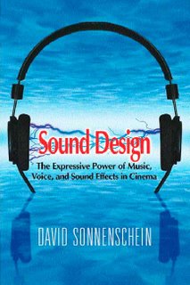
The next is a book cover of "Sound Design". It is really impressive with a headphone in the center. This picture is also very relevant to the topic of the book. The color simulate the sky and the water. The text "Sound Design" is emphasized strongly. The name of the author is created as if it is submerged into the water and also creates a balance.

This is the cover page of the book "The Design of Everyday things". The cover page looks simple but speak for the topic of the book very well. The samovar is red so it creates the contrast of proportion and make it emerge from the background. This picture also represents all things in the life around us so it is very suitable for this book. The text is special in the point which the shape of the letter "S" looks like the samovar. Very impressive.

The last is a cover page of "Design Like You Give a Damn". The cover page looks strange at the first glance. It is divided into 2 balanced parts. The direction of text and picture is opposite. The color also fit together and emphasize the text.