Typography pieces
Travelling on the Internet and incidentally catch a collection of compositon and typography. We have just had a exercise about composition and and a little bit typography. I have took the first glance about typography through this exercise. Seeing the professional designers' jobs will be the best way to improve myself. Some typography poster impressed me. Here is a poster named"Number 1" of Paula Scher in 2005:

In this poster, she used a lot of number 1 to create a big number 1. Small number 1 were made from many typefaces. She also gave enough white space around.

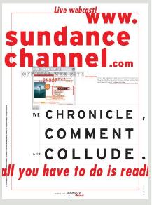
"Sundance Channel" is a poster made by Barry Deck in 1998. He has used a rather strange style in this poster. The horizontal sentence "all you have to do is read" almost went out of the poster's margin. In addition, he used big size fonts and color red to emphasize the page address and its content. Information was grouped into blocks to make the poster easy to read. The next is "Cyclon typeface" by Hoefler & Frere-Jones (New York), a advertising company in 2005:

Designers tended to create a balance. They says: "In developing Cyclone, we identified one of the culpritssix letters whose design can dramatically polarize the disposition of a typeface". They want to use addition and alternative of words (it means each word has its own alternative word) to make the typeface either solemn or versatile and flexible. The last poster I show you is "now read this" by John Berry in 2005:
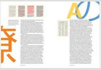
Here he used the left-align text. Texts were arranged into columns so they create a invisible verticle lines. Two columns also made balance. Big words "A", "e"... also made sense although they are difficult for us to understand! Whitespace was also used enough.
You can find more great pieces of design in this page:
www.aiga.org

In this poster, she used a lot of number 1 to create a big number 1. Small number 1 were made from many typefaces. She also gave enough white space around.
"Sundance Channel" is a poster made by Barry Deck in 1998. He has used a rather strange style in this poster. The horizontal sentence "all you have to do is read" almost went out of the poster's margin. In addition, he used big size fonts and color red to emphasize the page address and its content. Information was grouped into blocks to make the poster easy to read. The next is "Cyclon typeface" by Hoefler & Frere-Jones (New York), a advertising company in 2005:

Designers tended to create a balance. They says: "In developing Cyclone, we identified one of the culpritssix letters whose design can dramatically polarize the disposition of a typeface". They want to use addition and alternative of words (it means each word has its own alternative word) to make the typeface either solemn or versatile and flexible. The last poster I show you is "now read this" by John Berry in 2005:

Here he used the left-align text. Texts were arranged into columns so they create a invisible verticle lines. Two columns also made balance. Big words "A", "e"... also made sense although they are difficult for us to understand! Whitespace was also used enough.
You can find more great pieces of design in this page:
www.aiga.org
posted by Vo Anh Tuan at
4:58 AM
![]()


0 Comments:
Post a Comment
<< Home