Green Glass 2

Welcome to my blog!

I am looking at life through a green glass...
____________________________________________________________________________

Monday, November 27, 2006

Some feelings about Saigon Open City

"Saigon is now an open city as it was 300 years ago". These are the words of Mr. Nguyen Quan, an art writer in Saigon. It is also the name of the special, unique and first appear exhibition about contemporary art: "Saigon Open City". I had chance to attend a meeting on Monday with all directors, curators and some artists of this events. My initial feeling is actually not good when I saw the small building and the disorder there. However, some example art works shown here have raised my eagerness again. In the meeting, directors, curators and artists here have told about difficulties which they encountered when setting up the exhibition. The main reason is that the event like this is so new in Vietnam and it took a long time to get used to. I am a Vietnamese too, so I can understand this problem. In my experience, I think that most Vietnamese people do not care about art because they think that art is academic and hard to understand. The things they most think about is how to earn more money because they are not rich. When my friend went to the meeting location, she asked other people here and no one knew about this event. Generally, I think that this is a long process to make Vietnamese people get used to events like this.

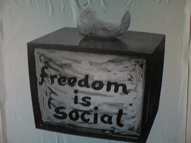
About the showroom, I am really impressed when meeting famous artists and curators the first time. All art works here, although hard to understand, still attract me. The name of the first chapter is "Liberation", the process to free yourself.

The meaning of Liberation can be perceived differently by other people in different context. There are always many ways and questions to answer.

The way they arrange texts and images is also very special and I really eager to see these art works in the main events next Sunday. However, I wish I have more time to read and understand or perceive the contents of these art works.
I am also intriqued by the ONOCHORD of Mrs. Yonoko with the message of love : "I LOVE YOU" but I can not understand. Somebody can help me please.
I hope in the next two chapters, they will fix the problem and make it really become an International Contemporary art exhibition of Vietnam.

Thursday, November 23, 2006

Some thing about my presetation topic

The topic of my presentation is Hypertext and Hypermedia and I have to say that it is not easy to find examples of this topic. Thanks to Mr. Rich I have got some websites about the projects of
Hypertext and Hypermedia. If you like you can go there and take a look:
davidsmall.com
http://hypertextkitchen.com
http://artport.whitney.org/
http://acg.media.mit.edu/people/fry/valence
http://www.aspaceoftime.net/virtual.htm
While research about this topic, I also found a program which designed by designers and artists. This is Processing. This software helps designers, artists, and other people who do not have much knowledge about programming language to create interactive media. The good example of the application of Processing is the project named "Glass" of Barbarian Group. This project has been used for the exhibition named Wired Magazine's NextFest celebrated by Goodby, Silverstein & Partners.

In this project they use Processing to create a simulation of grasses which whiffling along
with the wind. The interesting thing is that when there is a visitor going by the screen, the grass will move! The Barbarian Group applies this on a big screen made from fabric and it is very realitic and impressed.

In order to bring the image on the screen and make it move when a visitor passing, they
use a camera to record the movements of visitors and then send them to the computer. Processing
sofware then calculate to make the grass move. After that, the computer will send images of grass to 4 DLP projectors behind the screen. These projectors will show the images of grass onto the screen.
The online version of this project is at this link:

http://portfolio.barbariangroup.com/nextfest/index.html
I think that if we can apply this project, it is really amazing.

Friday, November 17, 2006

Student Diary contest


RMIT has opened a contest of designing the cover page of Student Diary. Looking at the old coverpage of the year 2006, I am really impressed by the innovation of this. The use of black and white is quite good although I think the pencil is so big and the word is so small. Generally, it is a great piece. It also intrigues and stimulate me to do a coverpage. I think it is only a practice for me. So this is my coverpage.


I used the picture of the window to represent the future which there will be one more building will be build. The words "Student Diary" are alligned vertically to create a strange composition. I also use a font which look like hand-written words. I used color gray to make a neutral feeling and to fit with the picture. The contest does not have printing requirement so I did not care about trapping. Just for experiment not for winning the contest!


Expressionism, impressionism and constructionism

The colors of a image come to our eyes and invokes meanings through three main ways: visually (impressionism), emotionally (expressionism) and symbolically (constructionism).
Impressionism appears in mostly painting in 19th century. It has some particularly characteristics: brush strokes, light colors, open composition, unusual view angle and special emphasis on colors and lights. Some typical impressionisms are Monet, Renoir, Gustave Caillebotte, Frédéric Bazille, Mary Cassatt , Edgar Degas. These paintings are of Monet, Renoir and Degas respectively. You can see the characteristics of impressionism easily in these artworks:

All colors in these pictures are very bright with a open perspective. They combine to convey a mood, a feeling of the author. For example, in the third piece, we can feel the peace and love because we see the light green of grass and the girl and the child with white cloths and the sky.

Constructionism uses symbols to convoy meanings. Actually, it is a concept and a tendency in the field of philosophy. On the point of philosophy, constructionisms break everthing into parts and build up their structure. All things in the world are complicated constructed rather than simple shapes and meanings. In art, there are some artworks which demonstrate objects in form of shapes, lines..

This is the way impressionism convey their feelings in artworks.
Expressionism appears in 20th century. Artists in this field like to express their emotions by distorting reality. Very famous paintings are The Scream of Edvard Munch, On White II of Kadinsky, View of Toledo of El Greco...

Some other expressinism are Egon Schiele,Franz Marc, Rolf Nesch, Wassily Kandinsky,El Greco. In these pieces, as you can see, they lack of beauty and aesthetic and are very abstract. However, the colors, shapes and special the whole perspective bring to viewers "strong emotions with the drama and often horror of the scenes depicte". In other words, expressionisms want to demonstrate their emotions and themselves.

Colours for Web

Web design requires a different colour theme and colour processing because of its particularly characteristics.In CRT (Cathode ray tube) screen, each pixel composes of three dots. Each dot carries one of three colours: Red, Blue or Green. When we see the image on CRT screen, our eyes mix these dots in order to produce the specified colour. In web design we use hexadecimal numbers to discribe a colour. For example, colour black is interpreted as #000000 and colour white is #FFFFFF. Web-safe colour is also applied on web. This method appears when people still used computer screens which were only capable of displaying 256 colors. In these days although most web-users use high resolution computer screen (over 16 million colours) but this method is also used for some reasons. Firstly, when using web-safe color theme, you ensure that you web page will be displayed properly and secondly, it ensures that your web page will work on High color monitor screen.gfsdfg
Using right colour theme and contrast is very important for web because when you create a web page you wish that it will be interesting and readable for everyone on the Internet. The application of colour theory is neccessary. Beside main colour themes: complimentary, split complimentary, analogous,... you also have to consider the harmony between text and background because this is the main part of a web page. Firstly, you should avoid colour clash, such as red for background and green for text. Secondly, you should retain the natural values of colours, such as yellow should be lighter than blue so it is not good if yellow is darker. Finnaly, there are some colour themes which have high readability such as black and white, blue and yellow... Moreover, some web users are blind in colours so you should choose a colour theme which is not hard for them to read, such as red and green should be avoided.

There are many colour schemes available on this pageColors on the web which you can refer to when designing a web. This page also provides tools which are neccessary for designers such as color combination. I also found a useful tool on Black board named Color match 5K. If you have trouble finding a color scheme for your web, take a look at these tools.

Wednesday, November 15, 2006

My poster for the "Terry Fox Run"

I am a volunteer for the "The Terry Fox Run" event which will be held in December. I created this poster for this Run. Terry Fox is a Canadian man which has fighted with cancer for a long time and it has took his right leg. Although there is one leg left, he decided to make a run over the Canada and America. After he died, people celebrate the "The Terry Fox Run" anually.
In this poster, I want to emphasize the fake leg of this man so I make the word "Terry" thin and arrange it along the leg. I also make the word "FOX" bigger in the left leg to emphasize the right leg. The background is the picture of a road which converge into the far point. This background represents the long way of hope which Terry has run. I hope Mr. Rich and everyone will join this run and donate for the cancer fund.

Thursday, November 09, 2006

Golden ratio

I have heard about Golden ratio in class and it really attracted me. This ratio was applied in many fields of art. Particularly, it is widely applied in designing medieval book. Artists often use Golden ratio by using Golden rectangle. Firstly, they draw a perfect square. After that, they draw a line from the middle point of one side to an opposite angle. This line is a radius of a circle which defines the side of Golden retangle.

The Golden ratio is applied in lengths of sides of this rectangle.In book design, margins and type area are important things which are most considered. There are two main methods: Van de Graaf Canon and Golden Canon. These methods do not apply exactly the Golden rectangle but in approximation.

The Golden canon is more closer to Golden ratio or Golden section. According to Tschichold, the creator of this method, the Golden section includes type area and has a propotion of 1:1.618 and the proportion for other elements of a book's page is that "Page proportion 2:3. Margin proportions 1:1:2:3".

Although these methods are old and applied in medieval books, I think they are still usefull for us today. I know that I have an assignment about designing book cover page in this semester so this may give me some concepts. You can learn more about Golden ratio in Wikipedia

Tuesday, November 07, 2006


Here are my composition exercise
The first one was created with Tahoma. I intended to create a balance so I divided the name of the Ochestra into two parts and put them into two opposite angles of the paper. The word "and" is in the center and other words were arranged around it.


The second one was created with Times New Roman. I just arranged words in order to form shapes of opposite triangle.

Wednesday, November 01, 2006

"Nhin"-Phan Y Ly


"Nguoi Lao Dong" Newspaper (Thursday,Nov 2th,2006) has represented the new play "Nhin" of Phan Y Ly. She was born in Hanoi and has worked 3 years for UN. She is an artist in the field of experimental theatre. The previous famous performance of her is "Oe oe" in the beginning of the year 2006.
Experimental theatre is the place for young artists which have passion for plays to do experiments. The first experimental theatre is Nhap theatre, operated by Phan Y Ly. "Nhap" means "draft" so young artists can freely do experiments and apply thier ideas in plays.
"Nhin" is a new play which is made by the corporation of Nhap theatre and Saosong theatre (Thailand). In this play, Phan Y Ly has applied multimedia to create a special effect, particularly video and movie effect. The content of this play is about sex and the Internet. A boy accesses the Internet and meets many beautiful girls. One day he meets a very special girl and she totally attracted him. However, he says some bad words to her and make her painful. She decides to leave.
"Nhin" will be performed in three university in Ho Chi Minh city. One show will be performed in Melbourne theatre, RMIT Vietnam at 4 pm Nov 3rd, 2006. It is a chance for me to discover a new kind of theatre which relates to my career.